Last month we ran our Behaviour Change Taster session for frontline professionals and volunteers across Norfolk, delivered on behalf of Norfolk County Council. Whilst previous topics covered things like behaviour change interventions through communication, this session looked at nudges; the small, often invisible design choices that shape what people do.
People often assume that if you want someone to do something different, you need to convince them, persuade them or make them care more about it!
But let’s use an example of pensions. Up until 2012, you had to opt into a workplace pension. However, the UK then introduced workplace pension auto-enrolment – since then, you’re enrolled by default and have to actively opt out. Participation in pensions rose from 47% in 2012, to around 88% by 2023/24 (DWP, 2024). For most – same pension, same benefits. Nobody was persuaded of anything it was what happened by default!
Shaping of choices
There are four key ways choices get shaped:
- Defaults: A default position – not an active decision.
The pension example above is a classic case, but we see it in health settings too: patients invited to breast screening with an already-booked appointment attend at far higher rates than those given a number to call or book themselves,
- Framing – how the same facts are worded.
A trial of cervical screening invitations tested three versions of the same letter: a standard letter, one framed around what someone would gain by attending, and one framed around what they’d miss by not attending. The “miss out” version outperformed both of the others – same facts, different wording, different response.

- Noticing – what stands out and what gets missed.
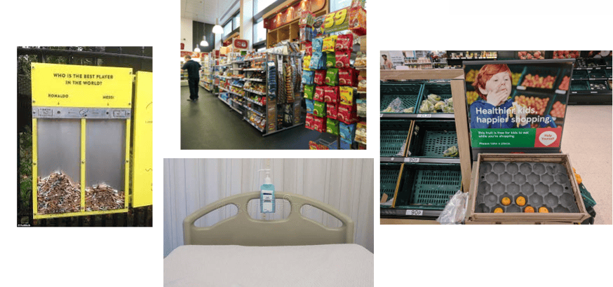
When calorie labels were introduced on restaurant menus in England, only around a quarter of customers said they’d noticed them – a reminder that adding information isn’t the same as making it noticeable.
- Layout and order – where things sit, and what comes first!
Research into NHS staff shops and canteens found that proximity, visibility and ease of reach consistently shifted what staff bought, regardless of what was actually on offer.
None of these replaces good services, honest information or proper support.

Have a go yourself…
Pick a challenge from your own work, things like incomplete referral forms, instructions that don’t get followed, unhealthy choices, or even mugs left in the staff kitchen! Before jumping into the four questions, it helps to picture the exact moment the choice happens: where is the person standing, what are they looking at, and what happens if they do nothing at all?
Then ask the following questions
- What is the default right now? Is it the one you would want?
- How is it currently worded? Could reframing it change the response?
- What is easy to notice and what is easy to miss?
- How are the options laid out or ordered, does the position help or hinder?
You don’t need to redesign the whole process, just pick one of these and have a go.
A worked example
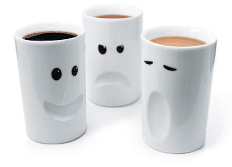
So… let’s take the dirty mugs left in the staff kitchen.
- Default –right now, the default is that the mug stays dirty unless someone choose to wash it. So, the default could be flipped, with a “clean” tray and a “used” tray – so the easy, no-effort action is to place the down to be washed, rather than leave it on the side and walk away? Although…this might not get the mug washed…so…
- Framing – A sign reading “please wash your mug” states a rule. A sign reading “the next person waiting for a coffee will be using this” reframes the same request around a consequence for a colleague – it is more likely to land differently than a generic message or instruction. So, what about option 3?
- Noticing – A sign taped above the kettle, or sink – at eye level, right where somebody is already standing is far more likely to be seen than the same wording on a say a staff noticeboard, or one of those email reminders!
- Layout and order – This one might be a bit trickier. This is all about relative proximity – if washing up is on the way out of the kitchen rather than out of the way, it becomes the path of least resistance rather than an extra detour.
None of these change the rules – nobody is being forced to wash their mug, and nothing costs anything. What changes is how easy, visible and socially framed that one small action is. This is exactly the point of a nudge.
So next time something isn’t happening the way you’d like, whether that’s referral forms, appointment attendance, or yes, even the mugs, it’s worth asking whether the answer is more persuasion, or a smarter default, a clearer frame, a more noticeable cue, or a better-placed option.
Want to find out more about behaviour change?
Sign up to our newsletter here and hear all about the very latest developments in behaviour change.